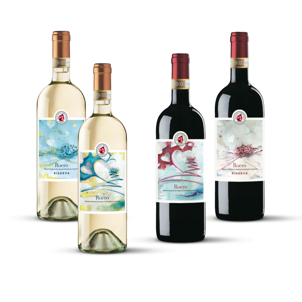
Right from when it founded, one of the aims of the Consorzio di Tutela has been the promotion of the DOCG of Roero Bianco and Rosso and its territory. For this reason, the designs for the first institutional labels of the DOCG have been entrusted to an artist from Bra, Feny Parasole, born and bred in Roero, well equipped, therefore, to transmit the essence of the land in her creations.
Feny Parasole, an artist of international renown, was awarded the Prize for her Career at Montecitorio in 2018 and is inserted it the Atlas of Contemporary Art published by De Agostini. She has used a mixed media technique: an ink-drawn base onto which watercolour has been applied. The graphics project was carried out by Barbara Facchin of the Turin studio Labelcinque.
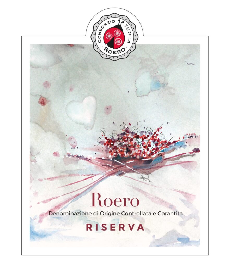
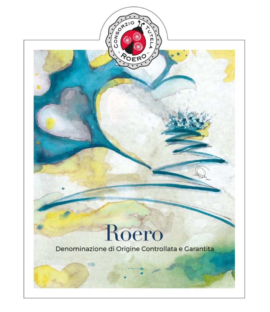
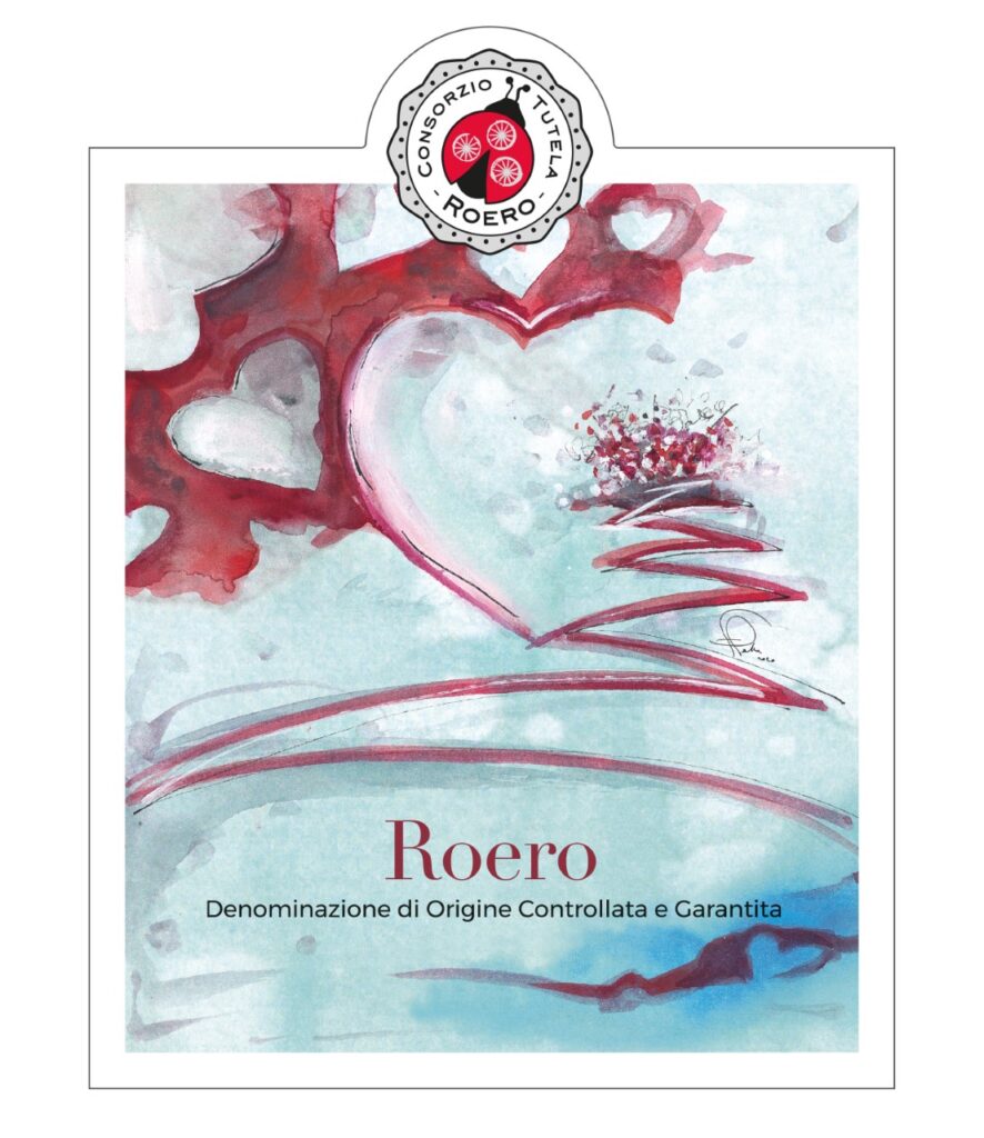
The chosen colours remind us of those of the landscape. White for tuff stone, typical of the terrains of Roero where the tradition of the farmers was to dig out underground cellars to store bottled wine; blue for the waters of the Gulf of the Po – an internal sea which occupied the Roero area until about two million years ago – and the river Tanaro, whose catchment moulded the shape of the land; green for the vines, straw yellow and ruby red for the wines of this land. The result: unique artworks, just like the wines themselves, Roero DOCG Bianco and Rosso. “We wanted an authentic voice for the institutional labels, one that lives each day in this land which is so bound up with the identity of our wines.” says the president of the Consorzio, Francesco Monchiero. “We’ve chosen an artist endowed with a special sensitivity, who can unite different techniques just as our wines are the result of a harmony of many components: vines, land, people.”
In the labels for Roero DOCG Bianco and Rosso the hearts are the subject and the frame. They represent the emotion, simple and profound, that we feel on tasting the wines, carrying us away on a sensorial visit to the vineyards set among the hills where it all began, represented in undulating lines. The hearts are open, evoking a wine that can spark emotions in those who drink it and the softness of the forms are inspired by the rolling hills.
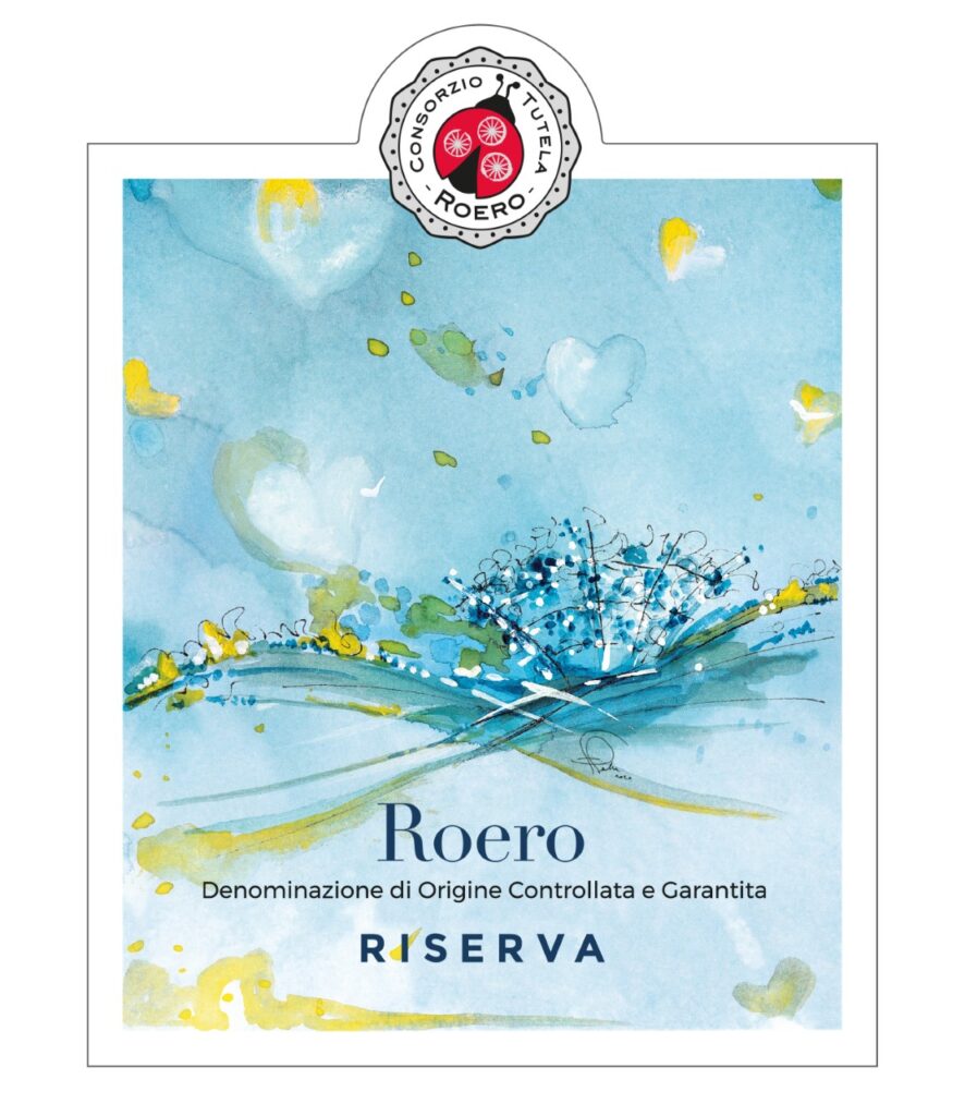
The labels of Roero DOCG Bianco and Rosso Riserva portray a row of vines that evokes an old vineyard ruffled by the wind, a light, dynamic image.
The institutional labels are used by the Consorzio di Tutela Roero for communication activities and collective promotion.